I built this three-value custom palette theme/style from the colors of the iOS Evernote app. I have a macro palette that appears when I'm in Evernote, so this adds a little bit of the Evernote color despite the lack of color in the Evernote Mac app itself.
This is still a work in progress, so please feel free to suggest changes.
To use this theme yourself, open Terminal and execute this command: defaults write com.stairways.keyboardmaestro.engine CustomPaletteTheme "153,87,53, 0,0,100, 153,62,65"
The theme will then appear in KM's Theme Editor as Custom.
Also, what are the “highlighted letter” and “selected highlight letter” (as describedhere? What do they do?
Here’s the full six-value theme I’m trying to build.
background 153,87,53
text 0,0,100
highlighted letter 153,62,65
selected background 154,62,64
selected text 183,35,100
selected highlight letter 358,88,100
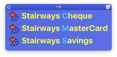
The highlighted letters show up in the Conflict Palette.
When you get finished with your theme, send it to me and I'll add it to the included themes. I can't use Evernote without permission, but I'm thinking Evergreen would be a good name for this theme.
Evergreen sounds like a great name. Thanks, Peter! I’ll send it to you when it’s finished.
The HSB color values I’m getting displayed by KM, even opacity dialed up to 100%, are very different than the values Photoshop is reading. I see in the documentation “the background brightness is dropped by 33%”, but the saturation level is also being affected. If I up the brightness value by 33% the color still doesn’t match.
For example, I specify the background as 153,100,48 but it comes out to be 152,65,56. With the saturation already at 100 going in, I can’t compensate for the 35% saturation reduction.
I WAS able to get around the automatic darkening of the Selected Background value, though, and produce the color I wanted.
Keyboard Maestro mostly uses the hue and then adjusts the other settings depending on various factors - which is why it uses HSB instead of RGB. Then on top of that there is all the colour matching and what not (that Photoshop does, and that Keyboard Maestro does not do, and that the system does who knows what with).
So to a degree it is going to be a case of fiddling with them until they look like you want them too.
Your colours in the email look good - not convinced on the black selected version, so it may be a bit mangled by the time I’m through, but hopefully you’ll like it.
Any progress on changing palette themes?
Or, was it just a custom, one-off project?
I, too, want to change palette colors, but for a different reason.
Most palette options in KM are “reverse type” – light color fonts on dark background.
Notoriously difficult to read.
My goal is opposite of that: dark fonts, on pastel color backgrounds.
Easy to read quickly.
Different background colors for different purposes.
Example:
I use one application for three functions:
NeoOffice for (1) spreadsheets, (2) text editing, (3) drawing.
Have three macro groups.
Useful if could use three pallet colors, specific to the macro group.
But my choice of colors to avoid the “reverse type” of most standard KM pallet choices.
Is there a way – creatively using KM+AppleScript – to change colors in KM pallets, or to add custom pallets?
If someone wants to write such a script for me, I’d pay for that.
The style includes 3 or 6 HSB colors (being background, text, highlighted letter, selected background, selected text, selected highlight letter) each specified as hue,saturation,brightness. The background brightness is dropped by 33%, but if there are only three colors, then the selected background color is the background without the 33% drop. You can select the Custom style in the Theme Editor.
If that does not get you what you want, then you’ll need to ask a more specific question.
If that does get you a good result, then email it to me for possible future inclusion in Keyboard Maestro.