Is this to make the insertion point's position more obvious in a sea of text?
Accessibility settings only seem to let you set the colour of the insertion point these days. There used to be utilities that let you make it bigger/bolder, but the tricks I remember used ResEdit so died with OS 9!
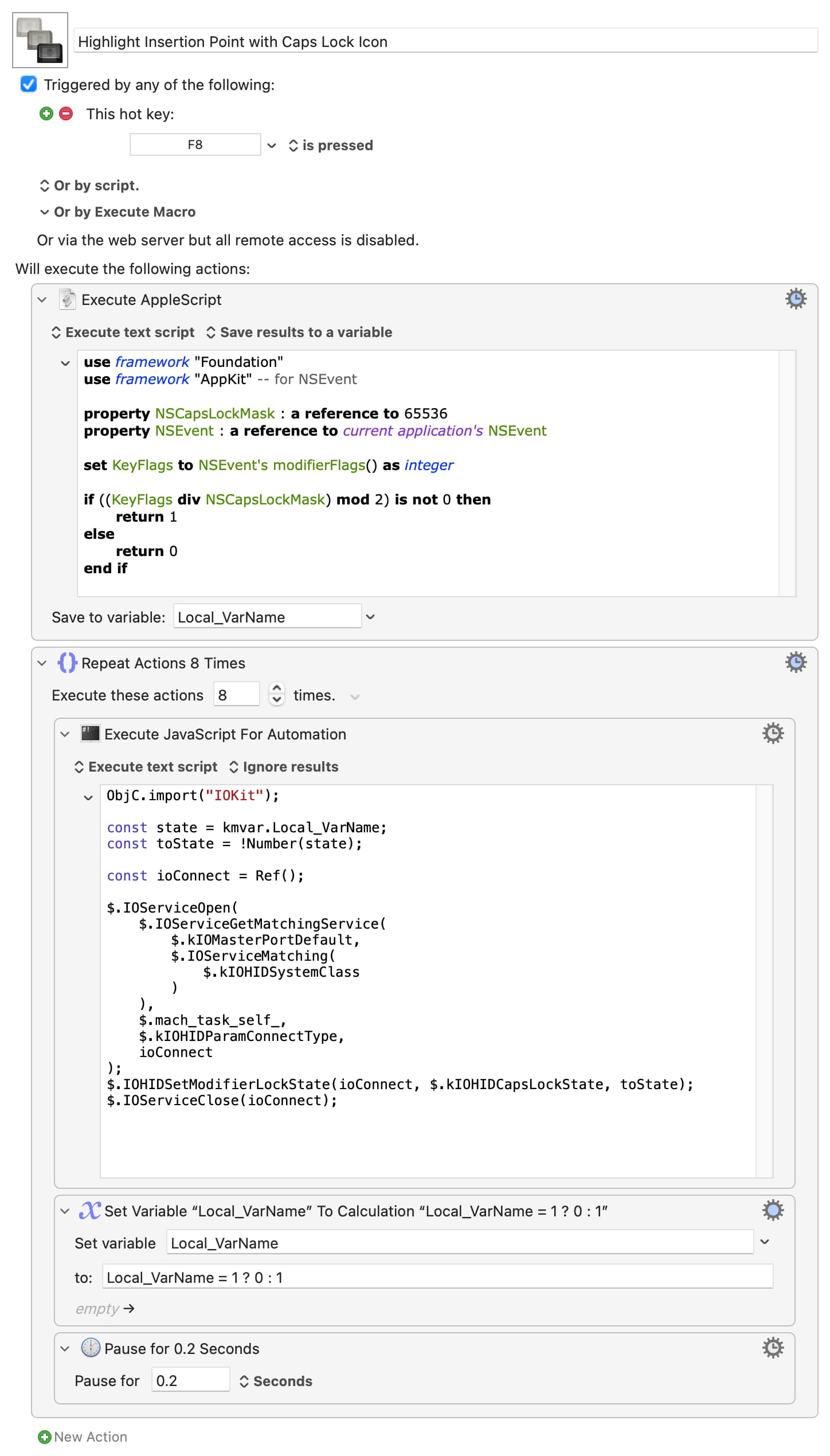
Thinking laterally, could you use the Caps Lock indicator as a proxy, drawing your attention to the right area of the screen? If so, and borrowing heavily (stealing!) from this thread, something like the following could help:
Highlight Insertion Point with Caps Lock Icon.kmmacros (22.3 KB)
I'm clueless with JXA so, if it is useful, perhaps one of the JS gurus will be able to step in and put the repeat-with-pause part into the JXA action so it doesn't waste resources repeatedly instantiating the environment.