Hi @Zabobon and @cdthomer. Thanks for your comments and suggestions. I suspected this butt-ugly dialog might generate feedback. Originally I thought that I'd better try to justify it, but then I decided to throw it out there and let the comments come in. Thanks for playing along. 
I've had issues with repetitive stress injury from mouse overuse; thus Keyboard Maestro, in general, has been a godsend. Although dialog boxes are great in many ways, they are often not optimized to minimize mouse use.
This might be one place where aesthetics (and mobile) have worked against keyboard-only control of dialog boxes.
Remember radio button controls? More on Windows that macOS, there were radio button controls where the selection (i.e., a mutually exclusive choice) could be made with the keyboard by pressing the character indicated within a buttons label. They weren't pretty, but they were efficient.
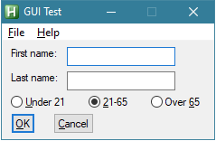
In general, radio buttons have gone as the dodo bird and been replaced with popup menus. I suspect that it's because radio buttons are less space-efficient.
Some mac programs have dialog controls that can be operated with the keyboard, however they are rarely indicated with something as obvious as the labels with an underscored character.
So back to my ugly dialog and your suggestions. In light of the Prompt For User Input constraints and my design goal to minimize mouse dependency:
-
@Zabobon's suggested approach is normally what I do, for example in Log It. Popup menus provide a mutually exclusive choice, but they still require more mouse control than I'd like: 1) move the mouse to the popup menu, 2) click the popup menu, 3) move the mouse to the menu item of choice, and 4) click the choice.
-
@cdthomer, if sliders included a numerical indication then they could work (because increments can be clicked; sliding is painful), but as they are designed, IMO they just don't work well for this situation.
Considering my design goals, maybe it would be better to exclude the checkboxes altogether and save the number entered in the Custom Length.
Now imagine the feedback if I had used 1 or 0 values instead of checkboxes for Lowercase Letters, Uppercase Letters, Integers and Symbols. That would have taken this dialog to another level of ugliness, but it would be easier to control without the mouse. 
BTW, note that there is a similar issue with the symbols: Custom Symbols override Symbols (the full set). I added the Custom Symbols option because some sights restrict the symbols that can be used.
Hum, maybe a Custom HTML Prompt is the way to go.