Hello,
For a future upgrade, in the macro list (the list between the groups on the left and the macro on the right) perhaps consider making inactive macros stand out (perhaps a  ️ icon).
It wou make it easier to determine for example if a keyboard shortcut is already in use by an active macro.
thanks for considering my request
Are disabled macros not shown in light-gray type (grayed-out)? This is fully effective for me on my machines & monitors.
Perhaps useful: you can sort macros by key-chord (a/k/a “shortcut”). The sort is alpha-numeric, so all key-chords sharing a letter are contiguous. Sort is actuated by clicking the down-pointing arrow in the header atop the column.
You would find, I think, that selecting the Macro Group “Enabled Macros” in the left column, and sorting them by key-chord, will help you discover key-chords that are not in use. Note that this can be refined by grouping macros so that they are available only for the applications in which they are used.
1 Like
the light grey was not conspicuous enough for me.
Your suggestion about looking at the enabled macros group and sorting them is excellent, and solves the problem
thank you very much
1 Like
You're welcome ![]() .
.
You might consider turning down the luminance and/or the contrast on your display. Almost universally users set display luminance to a higher degree than is optimal for seeing color and differentiating between similar light tones. Display luminance is controlled at " ▹ System Preferences ▹ Displays ▹ Display ▹ Brightness". Contrast is controlled at " " ▹ System Preferences ▹ Accessibility ▹ Display ▹ Display Contrast". Unless you have a specific need, keep this to "Normal". If you want to make UI controls more apparent, try checking "Increase Contrast".
2 Likes
works perfectly by ![]() luminance and contrast to normal as you recommend.
luminance and contrast to normal as you recommend.
Thanks very much !
1 Like
I have accidentally increased the contrast by 1-1.5 ticks in the past… I’m still not sure how. I remember once thinking the display must be overheating 
2 Likes
I will keep in mind that it can happen by accident. thank you
I came to the forum to make a suggestion about inactive macros and found this thread. My suggestion is simpler:
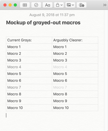
I like the simplicity of graying out inactive macros—but the shade of gray currently in use is too dark; there's not enough contrast between the grayed-out actions and the active ones.
Would you consider simply making the gray a couple of shades lighter, so that the inactive actions would be easier to spot? 
EDIT: Changed "actions" to "macros."
1 Like
Hey @soundsgood,
You've mixed and matched active/inactive macros and active/inactive actions.
Would you please clarify and provide a screenshot of what you find difficult to see.
-Chris
Hey, @ccstone,
I see I used the word "actions," instead of "macros." It was a simple mistake. I've fixed it.
I suspect part of the issue is that this is somewhat dependent on your display settings.
Certainly on my iMac, there is no question which macros are grey/dimmed and which are not.
On the MacBook it is less obvious.
1 Like
Thanks for the reply.
My primary workstation has 30" HD displays, set to millions of colors, but I have KM installed on two Mac Pros and a MacBook Pro (thanks for the great sync feature!), and the grays are fairly identical on each.
For me, the suggestion wasn't related to the technical limitations of hardware; it was merely a matter of aesthetics.  I can see the gray perfectly well. I was simply saying that the distinction would be clearer if the gray were a couple of shades lighter.
Here's what I mean:
That's all I meant. It was just a suggestion. Thanks again!
You're not the first to suggest it, and definitely some people, especially early on in their Keyboard Maestro use, have not noticed that a macro is disabled.
Obviously, the lighter the grey, the more noticeable it is, but also the harder it is to read at all (for example, in your mock up, I find the second column almost unreadable because it is so low contrast).
It's plausible that slightly lighter would be an improvement overall, but also clear (pardon the pun) that too light would be a problem as well.
Yes, that's understandable.
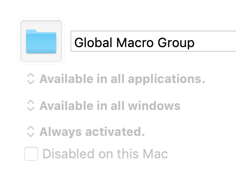
You're already using a lighter gray in the Global Macro Group. Perhaps that gray would be a compromise.
1 Like
Perhaps it would be best to use highlighting instead of (or in addition to) a change in the font.
Peter, perhaps it would be better to use some other indicator to indicate a Macro or Macro Group being disabled. Here's one possibility:
@ronald, @Kirby_Krieger, @cfriend, @soundsgood, et al:
What do you guys think?
1 Like
great suggestion ! clearcut, stands out, well localized.
Hey JM,
That's not a bad idea at all, although I don't especially care for the red strike-through icon. That tends to indicate danger to me.
I think I'd rather see a grayed-out variation of the disabled icon used elsewhere in the editor.
Something similar to this but more elegant:
![]()
-Chris
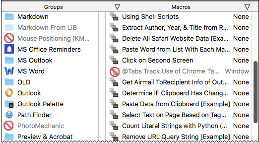
I don't know Chris. I suspect this is individual preference, but your icon does not jump out at me like the red one. Here's a comparson.
Choices:
![]()
Hey JM,
That's part of my point. I don't want it to jump out at me.
( I saw “Alien” one too many times and am scarred for life... ![]() )
)
The whole point of grayed-out items is that they don't jump out but are obvious by contrast.
I think a gray disabled icon (more elegant than mine) would place a greater emphasis on the fact that a grayed-out item is disabled without having to jump in my face.
-Chris
1 Like