Any way to detach the Action palette?

In teaching new users how to use KM (and in my own experience in getting to know the program), it seems pretty unnecessary/unintuitive/clunky to have to bring up, then dismiss the Action palette every time. Especially when creating a whole bunch of new macros (as when a new user is doing initial set up). The guy I'm working with now pointed out that the (almost invisible) 'X' that hides the Action palette now, should really be a 'Save' button, since it's disconcerting that there's no obvious way to confirm that your macro is saved.

I know that this may seem nitpicky or trivial to you power users, but it really seems like it would be an excellent option to make this amazing program a little more user friendly.

2 Likes

I get your point, and it would be handy to have the Action Panel in a separate, movable window.

As a workaround, you might try using the Insert Action by Name command, ⌘⌃A.

After you have some familiarity with the Action names, this is a very handy tool. It can even be faster than the Action Panel, when you don't know which Category the Action is in.

2 Likes

There is no "Save" in Keyboard Maestro. Macros are always saved. Just like working in the Finder for example (or many other applications).

Technically, Keyboard Maestro does slightly delayed saves, and if it makes you feel better you can see the "dirty" state at the bottom right of the window, which will appear when you make a change and disappear shortly thereafter.

But closing the Actions pane has nothing to do with saving. Neither do the checkmarks, or enables, turning edit mode on or off, or anything else. The macros are essentially always saved.

I'm sorry, it seems that I hit a bit of a nerve with my comments about saving. I completely understand that there is no need for a save command in KM, and that closing the Action pallette has nothing to do with 'saving' either. I was simply using my recent experience with a client to demonstrate how older users tend to be flummoxed by apps that don't require a Save command.

Now, Peter, can I bring us back to the question of whether or not you could create an option to detach the Actions pallette in a future release? As I said above, I think it would be very helpful for many of us.

Thanks!

As noted by @JMichaelTX, the “replacement” for the in-window action selector is Insert Action by Name, which is what you probably should use in general - I haven't removed the old way of doing it, and it does have some utility for novice users in terms of browsing actions, but for the most part the Insert Action by Name facility is better in general once you have a small degree of familiarity with the available actions.

Thanks, Peter, but tell me, is there any reason you couldn't create an option to detach the Action palette? While I now see the utility of the Insert Action by Name command, it's hardly a "replacement" for the in-window action selector. Especially for new users, or even the average user who, in my experience is not likely to remember the names of actions they might want to use, since they wouldn't be creating new macros often enough to remember much at all about how to use the app!

Would it be difficult to simply add the option? Even making it into a separate column, "in-window", would be a big improvement, in my mind. I'd love to hear if there are huge challenges to adding this feature as an option somehow.

Thanks, once again, for making the best damn shortcut utility out there (and I think I've used them all)!

1 Like

Anything is possible, it's all “just code”. It's not particularly easy, no, and given that most use should be based on the Insert Action by Name, which is generally far easier and quicker, I'm not sure I'll be able to justify the time - I'd be more likely to remove the action selector altogether than break it out to a separate window.

How is Insert Action by Name "easier and quicker", if one doesn't have all the actions memorized? Even if we did, typing out the name of the action requires way more effort than double-clicking on an action in the palette, attached or not. And how in the world would removing it altogether help a new user learn about everything that KM can do (or help an exist user learn more of its capabilities as time goes by)?

Does no one else here see the utility of being able to view the Action palette in its own in-window column (or detached panel, if that's easier to do)?

1 Like

As a user of KM for a terribly, terribly long time, I, too, have always absolutely hated the way the Action Palette effectively appears and "blocks" further activity outside the current macro.

especially now that I am aging, experiencing real cognitive degeneration, and do not live in KM daily, weekly, or even monthly (most everything I want is built and been working for years as is), I still need the Palette to remind me what is available and possible; there's just no way I'm able to memorize anything so deep anymore.

However, again, as it is built, it is terribly obstructive to a workflow. If the 'X' instead simply said 'close', it would aptly address the confusion OP pointed out; 'X' is often synonymous with 'cancel', whereas 'close' is pretty unambiguous and I'd think wouldn't worry a user about undoing an action. (the concept of Saving or the need to save is totally irrelevant here).

It has always been my desire that the Action Palette appeared (optionally, if need be) as a fourth (and technically, fifth) column, personally. I think we're far enough past the days of 1024 displays that there's enough real estate available for most users (I'd hope). Apple's Automator basically does just this; Library/Function/Macro Stage; and it lays out all one needs to build the macro in one window. Obviously, KM, needs the additional two columns for Apps and Macros lists.

And, please, please, please, @peternlewis, as expressed above, for gosh sakes, don't take it away altogether; I already struggle to make the occasional adjustment or new macro. (I'm still struggling to deal with the loss of easy-to-read and log-able Growl to troubleshoot!!).

@macdoc, FWIW, I have become accustomed to Command-K to show/hide the Palette; (for the life of me, I can't recall if that's stock KM, or I added it years ago via System Prefs). Also, there is, of course, the already detached Macro Library (Command-2) for a reference, but since it doesn't add an action to a macro in the same manner as the Palette, it doesn't solve my problems at all.
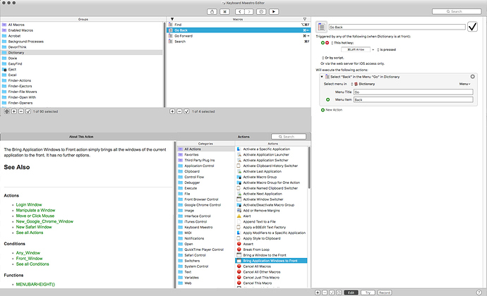
Thanks @Frederico. I'm glad to know that I'm not out in left field by myself on this. Interestingly, I've found Cmd-K to be a more helpful tool than Insert Action by Name, myself as well. Bottom line: it's nice to know that there's at least one other person that would love to see some sort of option to move the Action Palette to a place where it wouldn't have to be opened and closed all the time when building Macros.

Hey @macdoc,

I don't think anyone has ever been in love with the Actions Panel UI, but as Peter says it would take a LOT of work to change it at this point.

I suggest you make your own action pallet(s). Start with a few frequently used items and then expand from there.

I also suggest you look carefully at @DanThomas' magnificent KMFAM macro:

MACRO: [KMFAM] Favorite Actions and Macros

KMFAM allows the use of multiple mnemonic keywords for any given action, so finding things is pretty easy.

-Chris

@ccstone I don't think anyone has ever been in love with the Actions Panel UI, but as Peter says it would take a LOT of work to change it at this point.

I'm hoping I haven't offended Peter somehow, since he hasn't replied recently, but when I reread his last post, he said "anything is possible" but that it wouldn't be "particularly easy". I would hope that after seeing comments like yours and Frederico's above, that he might consider adding an option to show the Actions palette in a separate column in a future update (and yes, having it require a paid upgrade would be fine by me!)

@ccstone I suggest you make your own action pallet(s). Start with a few frequently used items and then expand from there.

I see that I could do that now, but it just seems crazy to have to build the interface I want in a program as great, and as powerful, as KM.

No offence taken on my end. I just didn't have any more to say on the issue.

Everything I do is a balance of a thousand factors, how much it benefits how many people, how much effort it takes to do, how much it fits with Keyboard Maestro, how much it extends Keyboard Maestro, etc, etc.

I understand some people like the action selector, and there is a reason it's still there and not removed. I also understand some folks would like it to be a separate palette or drawer or some such.

The action selector was originally intended to be a drawer, but the fact that lots of people have laptops with small screens makes that impractical for many people, hence the solution I chose - the editor window already takes 800-900+ pixels of width, leaving little room for a drawer or palette as wide as the action selector on a laptop screen.

As I said, yes, it could be done, but it is not something I can just flick a switch to change, it would take a lot of time to design and code, time that is then not spent on other things and so has to be balanced against them, and given the level of benefit, I doubt it will reach the threshold required for me to implement it.

I trust that is clear - it is certainly not a question of being offended, I am always happy to hear what people want. I just cannot (and also to a degree, will not) implement every feature requested.

Hey John,

When are you ever going to have a UI that perfectly suits you?

That's what we have Keyboard Maestro for.  :sunglasses:

-Chris

I'm guessing most folks would agree that the sophisticated capabilities Keyboard Maestro affords users also makes for a user interface challenge. I've used KM for 13 years now, and as its interface has grown more intricate, it's only since I read this thread that I had an approach I thought might be worth suggesting.

This is loosely based on the iTunes view option called Column Browser. It's just a rough mockup done with a few minutes in Photoshop so, if anything, this should probably only be critiqued in terms of broad usage considerations, not the intricacies of a user interface. Simply, could something like this be an improvement for users, assuming it's even something Peter would want to build?

There are pros and cons I already recognize, but I'll withhold those to let people consider this without my biases. I'll just note that the bottom left section was one which I wasn't certain how should be used, so without much thought I opted for that as a built-in Help section. Someone may have better ideas for that space.

Sorry, but I would object to any design based on iTunes, which is the worst UI ever designed pushed out on its users.

@peternlewis,

IMO, the KM Editor would work better if the "browser function" were decoupled from the "editing function". Once I am writing/editing a macro, I don't need to see Macro Groups and Macros list. They just get in the way and distract me.

I would greatly prefer to have one window/panel to edit a macro, and allow multiple windows/tabs to have multiple macros open at once. Like most every Mac software that supports tabs, you can also open the document in its own window. It would be so very, very helpful to have multiple macros open in side-by-side windows, so I an use one for reference, guidance, and copy source while I can still see my macro in development.

The "Insert Action/Token/Function by Name" works great, but I can definitely see how many would prefer to open each of those in a separate window, and then double-click, click an Insert button, or drag/drop to insert into the Macro being edited. Optionally, you could just have one window for these three, with each on a separate tab.

I would make the Macro Groups/Macros work like the Finder, even though we can't have sub-groups (but would love to have them). Put the Macro Browser in its own window, which the user can either keep open, or close until needed. Of course, there'd be a shortcut to open the Browser.

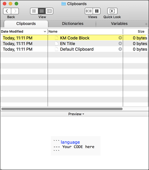
While we're in redesign mode, I'd also move the Variable List and Named Clipboard list out of Preferences (since they have nothing to do with prefs), and give each a window, which can be combined into tabs on one window. BTW, you should add Dictionaries to that. So, you could have one data source window with 3 tabs: Variables, Clipboards, Dictionaries. Drag a tab to open in its own window.

For example:

image