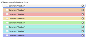
Hi @peternlewis - this is something I've been meaning to ask for a while. The Choice of Action Colors works really well in Light Mode - making it easier to spot certain Actions in Macros. For example, following the conventions of others on the Forum, I always use Magenta for Actions that are designed to be edited by the User (me or someone else) and Green for ReadMe and Notes.
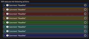
But in Dark Mode (my preferred Mode of using Keyboard Maestro) a lot of the default colors look similar and muddy meaning I tend to just use Green, Magenta and Blue. Yellow would be a good Color but it just looks brown in Dark Mode.
Do you think there is any way to boost these Colors for Dark Mode? I suspect the answer is "no, because they are part of the System" but I thought no harm asking...