-
Each trigger has the word "trigger" on the end, unnecessary.
-
The font is small, there's no grouping (except one visual line break), even alternating background color would help
-
Emoji would really help! (See pic for examples)
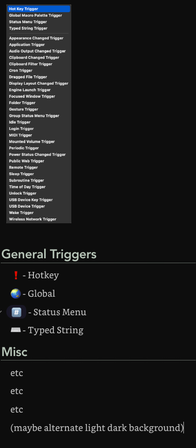
Each trigger has the word "trigger" on the end, unnecessary.
The font is small, there's no grouping (except one visual line break), even alternating background color would help
Emoji would really help! (See pic for examples)
The “Trigger” on the end may be unnecessary, but it also removes ambiguity and does not detract from readability since it comes at the end of the menu anyway.
The menu is a standard system menu, so the font choice and size is defined by the system.
The grouping is done alphabetically to make finding the trigger more easily, except for the first four which are the commonly used triggers at the front. Much the same as is typically done with countries for example. There is not a natural category break down that would be useful and generally understandable.
I have looked at menu icons, and they do not generally appear well so I don't use them, as well there is rarely good icons for such a large list of triggers. You can see the icons for the triggers in non-Edit mode, and they would not add anything to help find the right menu item.
No offense, but that's a terrible way to request for a feature. ![]()
Actually, you've already found the solution.
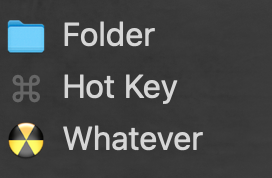
Create your own list (palette). With the triggers, the names, the order and the icons you want.
I know little about KM, probably there is a more elegant way. But it works this way too. ![]()
edit // Sorry if this is not clear enough.
Search image, the macro selects the trigger...
![]()
that you triggered from your palette.
Yes, this is not high level, but it works. ![]()