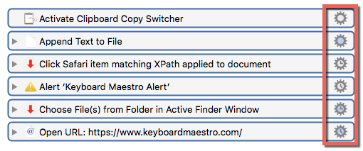
In case you didn't know, the "gear" icon for an Action has some visual cues to tell you what kind of options are available in the menu.
###Standard

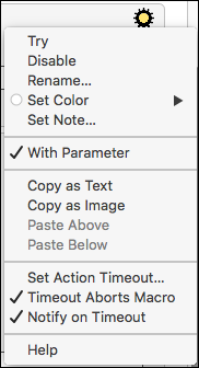
###Additional Parameters (blue inside the icon)
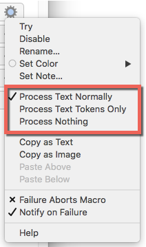
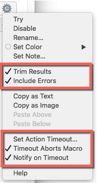
###Timing options (3 o'clock)
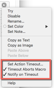
###Additional Timing options (4 o'clock)
NOTE: I've found at least one instance where the 4:00 icon should actually be a 3:00 icon. ("Alert", if you're interested.)
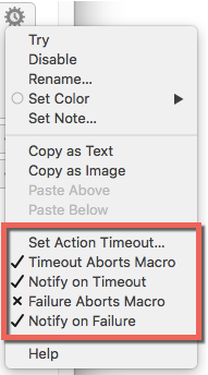
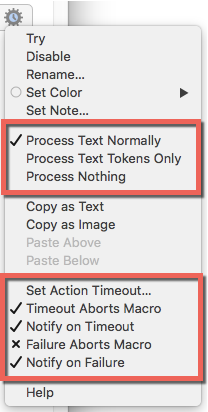
###Additional Parameters AND Timing options (blue 3 o'clock)
###Additional Parameters AND Additional Timing Options (blue 4 o'clock)
1 Like
Thanks for posting this, Dan. I did not know all of those.
@peternlewis, as we discussed elsewhere, the light blue (grey?) shading is very hard to quickly find with my eyes, unless I am specifically looking for it, and put my face in my monitor. 
"3 o'clock" vs "4 o'clock" !?!?
Are you kidding me? Can you reasonably expect most users to detect the difference?
The key to easy pattern recognition by the average person's eye is distinctive shape and color. The combination of the two is very powerful.
Please consider making some changes to the UI to help us.
Some may disagree, but, IMO, we need ONLY two gear indicators:
- Standard
- Additional Options
As an example of "Additional Options":
The yellow center is much easier to identify than the current light blue center.
I also like making the gear black.
1 Like
The 3 o’clock means the action could be configured to timeout.
The 4.5 o’clock means the action is configured to timeout.
The Alert action has a default 3 minute timeout, hence why it shows 4.5 o’clock.
These are not intended to stand out, they are not intended to draw your attention. They are there to save you having to open the gear menu to find out if there is something there if you are specifically looking for that information.
You can use Keyboard Maestro and never use the stuff inside the gear menu at all and hardly miss out on anything.
2 Likes