I agree. It took me (and some others) a while to figure this out when I first saw KM9.
Some users seem to like it (I never liked the oversized check/X), but overall I read confusion.
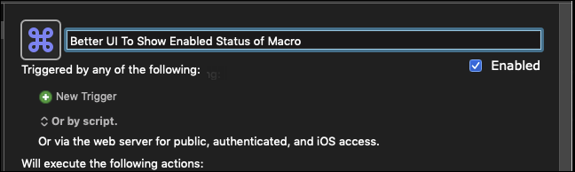
IMO, the obvious UI would be to follow that so often used by Apple and other developers: Put a checkbox with a label of "Enabled". Very clear to all.