this feature is no longer on the main screen title bar. It appears to be at the bottom, but is grayed out and non-functional.
Is there a new way to disable a group?
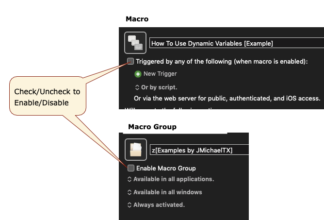
To disable a Macro OR Macro Group, UNCHECK the small checkbox in the top left corner, by its name:
I'm not finding this intuitive at all. Previously, the large X or Checkmark in the upper right said it all. Now there are several places to check and uncheck. The blue box in the upper left is ok, though it's placement suggests it's about the trigger action more than the entire macro. Meanwhile the checkmarks down below never change to an X though I see that the upper left checkbox does toggle on and off using the lower checkmark. I vote for clearer indications of when a macro is active, either by bringing back the big X, making the blue checkmark box bigger, and/or having the mirroring between the top and bottom checkboxes be clearer (such as a blue check there too or an X when the macro isn't active. Thanks!
1 Like
I agree. It took me (and some others) a while to figure this out when I first saw KM9.
Some users seem to like it (I never liked the oversized check/X), but overall I read confusion.
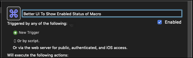
IMO, the obvious UI would be to follow that so often used by Apple and other developers: Put a checkbox with a label of "Enabled". Very clear to all.
Suggested UI Change
1 Like
Now that I know about the new check box. It seems to have disappeared.
It there a secret way to implement it?
@rpoland, if you are referring to the image I posted above, that is just a mock-up of my suggested UI change.
You don't have to worry about this if you're using this method as long as the menu items don't change → How to set a keybinding to enable/disable action / multiple actions? - Questions & Suggestions - Keyboard Maestro Discourse_2019-08-19
The checkbox under the name controls whether the macro or macro group is enabled or disabled.
Perhaps stick with the actual implementation then?
The implementation is not confusing, just different. The old large checkbox button confused lots of people. There is not generally consistent solution for enabled/disabled. But if there were, it would generally be a checkbox with the name of the thing that is enabled/disabled, which it is. Having it on the right hand side would not be an improvement, and would not work anyway since there is no room for it at minimum width. And it will not be changing again in v9, so let’s just stick to what it is. Thanks.