How To Organize Your Macros: Keyboard Maestro & Butler: An Integration

Apologies in advance if this is a repeat of anyone else's work. I haven't had time to research the forum.

That said, I developed a system - a system that works for me - to organize my KM macros by integrating KM and Butler. One of the perks of this method is that you can virtually get away with never having to use the keyboard (which I suppose is a plus for some but a negative for others). I personally love to use my mouse w/o having to fiddle with the keyboard.

Below this post is a link to a 4 minute video that demonstrates how I create a KM macro using my system. Note the KM palette called Insert Actions. It sits in a docklet at the bottom of the monitor. This palette is analogous to the Actions tab in KM except my Insert Actions palette has more specificity. Meaning, with a click of the mouse, I can insert a Pause ranging from .01 seconds to 30 seconds. With one click, I can insert an action that Simulates a Keystroke containing Command C, V, F or A; any of the arrow directions or the tab and more. Similarly, with a click of the mouse, I can insert Repeat Arrow L, R, Up or Down, Repeat-Tab, Repeat-Space, on and on.

Unless I'm creating a macro - as I do in the video - I rarely go into KM itself because all my KM palettes are in a permanent 'docklet,' sitting at the bottom of my monitor. They display as soon as my computer boots up. This is where the good graces of Butler. comes into it. There's a lot more to it but demonstrating how a macro is created, in the video below, shows a lot.

Ah yes: The demo that show how the macro is created, is 4 minutes long. An additional 1.5 minutes (5.5 minutes in total) triggers the macro itself, basically showing that it works.

If you don't like Nina Simone, best to avoid the last 1.5 minutes.

:slight_smile:

If anyone is interested, I'm happy to share more. If not, no worries.
http://www.acim.name/Keyboard_Maestro_Butler.html

Also a Butler fan. My favorite feature by far is pop-up menus, which aren't all that different functionally than KM palettes, but somehow to me feel much smoother to use. I have lots of KM macros incorporated into Butler pop-up and menu bar menus.

Clint,

This is powerful. I’m going to investigate Butler and hopefully, your sharing offer still stands. Thank You for showing your technique.

KC

Hi Clint, I am interested in your technique. All the more because I am not a Butler fan. I have Butler somewhere on my Mac and I never used it. I am really impressed by the "docklet" at the bottom of the monitor. If you have different macros to share or an explanation, I am definitely interested.
Jeando

Happy to, sorry it took me so long to reply. When I think about, what or how to share, I don't know where to start. Are movies okay at this point? I know the KM Forum has changed its policy re this...anyone know...thx in advance

Everytime I sit at the computer I spend at least a few minutes - sometimes hours - adding to my KM/Butler integration. (As weird as this may sound), I sometimes feel like typing is a major chore and so, I can almost do anything by clicking the mouse.

I'll include screenshots in my next reply but butler allows you to place pull down menus around the perimeter of your monitor. It's a very subtle program. At first blush, it doesn't look like much but the deeper you get into it, the more you can do.

Look at the top of my monitor - screenshot in the post.

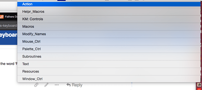
Halfway way down, actually a little more, do you see the word 'PAL.' That's a pull down menu with all my palettes in them. watch, I'll click on it

whenever I create a KM macro I export is as a trigger file into my trigger file folder. THen, I drag that macro (in the form of a trigger) into one of the pull down menus around the perimeter of my monitor. Butler also has this very efficient 'docklet.' This is what it looks like when you boot up

docklet

a tiny arrow that sits anywhere on your monitor. CLick on it and it becomes a mini dock that I like better than the mac dock. Here:

docklet

to take these screenshots, instead of pressing command shift 4, I just clicked the icon of a sunrise in my docklet (these are all KM macros that I exported as trigger files, assigned an icon to them and placed them around my monitor. watch:

anyway, I hope that helps...

The crux of it: I export KM macros as trigger files and store them in one 'Trigger' folder. I then drag these triggers into Butler which displays all my KM macros around the perimeter of my monitor, either as words or icons. So: All I have to do is click one or pull down a menu and click.

So: I have a lot of email addresses. If I click on the envelope icon, a pull down menu shows me all the addresses. When I pull down to one of them, that triggers a KM macro that launches a browser, brings up GoDaddy, wipes out the current user name and PW, inputs the current one and brings me to the email address. I also sometimes add prewritten emails. Here:

email_1

email_2

email_3

email_4

I'm with you there about typing as a chore and like to have as much option with the cursor as possible when I'm using it. An issue for me with your execution is the distance the cursor travels. With a 27" monitor, even with a highly sped up cursor via BTT, that's a lot of small targets to hit. Maybe fine for Hawkeye and I find it tiresome over time. Having a trackpad gesture to evoke a palette under the cursor saves a lot of aiming and travel time.

Still there is much to glean from your approach and I appreciate your efforts and your sharing them.

What can you do with Butler's fixed location menus that can't be done with KM palettes? Beside the aesthetic pleasure of them, which is important, what do they allow that KM palettes do not?

Thanks Clint!

The ability to click once, on one icon, on one location on your montior, to achieve your single final goal. (Rather than launching a palette, choosing an item in the palette, or pulling down to an item, sliding over, etc., etc.

For example, I have an icon on the perimeter of my monitor, named 'PA.' One click to that icon and I can insert a pause of any duration into a maco I'm creating, as I'm creating it, from .01 seconds to 30 seconds - with one click of the mouse.

44%20AM

Another example: Sometimes I want to clear all Finder boxes, apps and every desktop icon and search my computer using an application using Easy-Find. One click on one icon sitting at the top edge of my monitor achieves this goal. Here's a 10 second video I created to demonstrate this.

http://www.acim.name/clear_search.html

Please clarify as this occurs to me as two clicks. One click evokes a list of 23 items (times from .01 seconds to 30 seconds) that wasn't there prior to the click, then a SECOND click to select a time from the list. Then the list disappears after the second click.

If that's the case, I don't see the savings. The icon on the perimeter of the screen is the same (to me) as a menu item in the menu bar at the top of the screen that needs to be located, aimed at, traveled to, and clicked. The appearing list has a bunch of items that needs to be read, a target picked, aimed at, traveled to, and clicked.

How is this different than a list appearing under the current cursor location (evoked by a trackpad gesture or keystroke) like this list of times which is then read, picked, aimed, traveled, and clicked on?

I'm looking closely at all the particular actions my brain needs to coordinate (as far as I can distinguish) and movements needed to execute the command that a particular combination of screen display and cursor set up in a given geometry requires to navigate to issue a command.

For example, if I was looking at a list of 23 items to pick from. Particularly if the items were not as related to each other as a sorted sequence of numbers that internally guides your locating a particular items by its sorting, I would want the list to be clustered around the cursor in a square or circular arrangement to minimize the cursor distance traveled as contrasted to a single line long linear list requiring more travel due to its length. There is also the ease of reading the list and how unrelated list items are spatially related to each other to consider to facilitate locating a particular group if there is a menu/submenu process arrangement. @appleianer has a nice video example of menu/submenu at cursor location here: https://cl.ly/f41bad.

Does this make sense? Am I communicating something distinct from what you are saying? I know this is sounding wordy.

The second example looks to me like the same situation. A target in the menu bar needs to be located, traveled to, etc. which when clicked executes a series of steps that would be macro in KM.

I'm not trying to be disagreeable, like I said previously, I like what you are offering, I think I'm just more focused on a particular kinesthetic aspect of menu selecting. Please let me know if you are seeing something different.

Thank you for your engagement.