Hello,
I use arrows a lot in depicting systems and flows, and created simple KBM macros to type them.
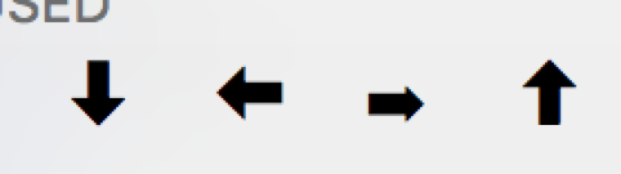
Funny thing, in the system symbols chart, the right arrow is smaller and less visible than the others, and it is the arrow I use most.
I would like to know if others have encountered the same problem, and if they found a solution
I would like to avoid emojis because they are handled differently in terms of formatting.
thanks very much
Yep, I see the same issue.
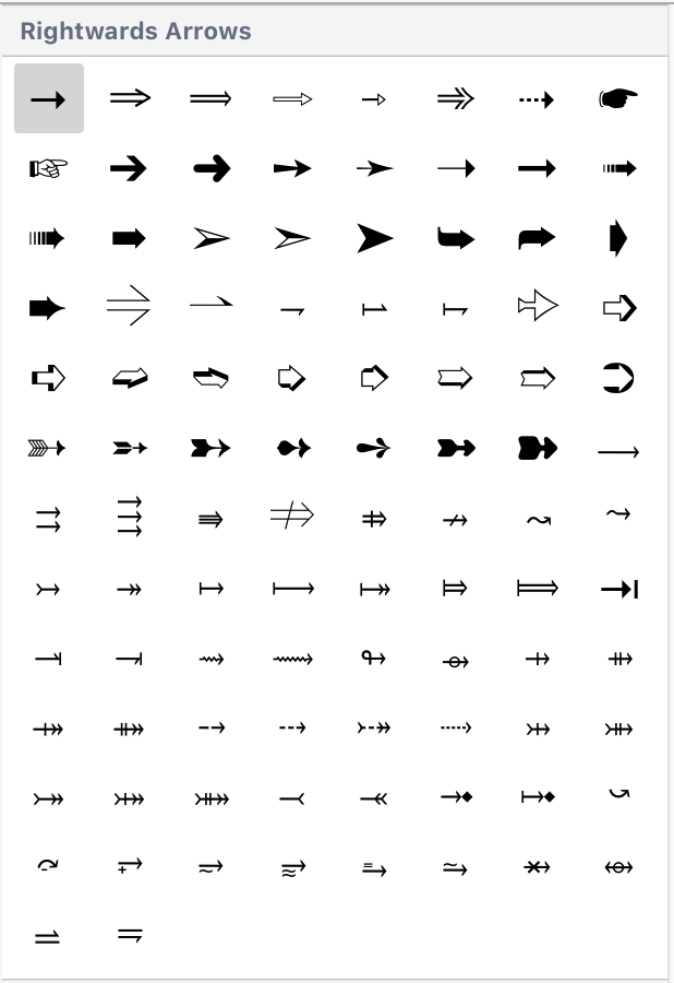
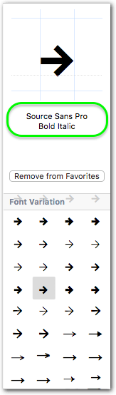
This appears to be a glitch in the macOS in selecting the specific variation of right arrow to use. If you notice in the Characters picklist, when you click on the right arrow, there are other "Font Variations" that have a larger arrow:

But even if I select one of these, it still reverts to the "standard" arrow.
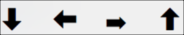
So, I use these as a workaround:
![]()
Even here the right arrow is not quite a large as the left arrow. Who knows why?
1 Like
This is a font issue.
There are many different unicode characters for leftward pointing arrows.
Each of those is a different unicode character.
As well as that, each unicode character will have different appearance in different fonts - this is what the Emoji & Symbols Character Viewer is showing in the Font Variations.
On top of that, fonts may implement any subset of unicode characters, and then the system will choose some other font to display the character.
So if you use the basic arrows (unicode characters named RIGHTWARDS ARROW and LEFTWORDSARROW in Helvetica font, you get this:

In all the fonts I checked, those two arrows were the same size, so check which fonts you are using.
2 Likes
@peternlewis @Tom
Thanks to both of you for your detailed response. Now I understand !
I'm glad you do, because it still does not make sense to me.
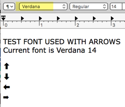
I tried setting the font in TextEdit for the arrows we were first discussing:
and their appearance did NOT change. In fact, the font actually would not change regardless of how I applied it.
I started with this:
Check the font of the left arrow:

Check the font of the right arrow:

So here is what I get, and I can't change the font of the arrows:

It seems to me that the macOS Character Palette is pulling the characters, in some cases, in an inconsistent manner, inconsistent font.
I have observed this on two Macs, both running macOS 10.11.6.
1 Like
Font: Very interesting. Would never have thought of checking the font.
I think that I did not express myself correctly. Yes, there is a panoply of possible arrows to choose from, but only very few are of decent size. The others are microscopic.
If you use a HBM to insert an arrow, you want the arrow to be large enough to be quite obvious, such as ![]() . There are other arrow formats, such as ↥ and many others, but the alternatives are too small. One can increase the font, but that creates a major pain because the subsequent text following the arrow will be in the larger font.
. There are other arrow formats, such as ↥ and many others, but the alternatives are too small. One can increase the font, but that creates a major pain because the subsequent text following the arrow will be in the larger font.
I think that the only solution is the one you suggested, namely ![]()
![]()
![]() and use ➤ for right arrow.
and use ➤ for right arrow.
what is the simplest way to search-copy-paste Characters? Using the System ⌃⌘ Spacebar has a rather poor search function.
thanks again
Thanks for giving me your thanks, but I still haven’t said anything in this topic ![]() So I’ll take this as an invitation and try to contribute something useful…
So I’ll take this as an invitation and try to contribute something useful…
As @peternlewis has explained, the arrows – as well as any other symbols or characters – don’t come out of nowhere, they are part of a font.
So, if you are working a lot with certain symbols, it may be wise to choose the body font accordingly: try to find one that has most of the glyphs you are regularly using and where the appearance of the glyphs is to your liking.
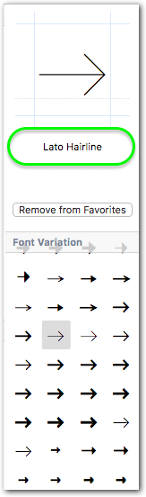
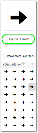
You can see the variants of a given glyph in the Font Variation section of the OS’ Character Viewer. If you select a shape it will show you the name of the font above:

If the body font of your document doesn’t contain the desired glyph (or only an ugly representation of it), then this means that you have to switch to a different font each time you want to have that glyph in the text.
This can be a problem, but not necessarily:
For example, if you’re outputting PDFs it doesn’t really matter how many different fonts you use. They are getting embedded in the PDF, with the only downside that the PDF will grow slightly in size.
On the other hand, if you are co-working with others and are giving your source documents (Scrivener, Nisus, Word, whatever) to your colleagues, it means that you have to provide them with all the fonts you are using in the document. Otherwise they are not able to display or print the document properly. Besides the potential legal implications, this can be a significant source of trouble, depending on the competence of your co-workers.
Please note that some programs switch automatically to a different font if they detect a glyph that has no representation in the current font!
(Nisus also does this, but it gives you a warning.)
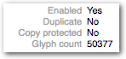
To get an overview of the glyphs inventory of a font you can also use the OS’ Font Book app. Select a font and switch to the Repertoire view (⌘2):

On the right hand side of the window you will see all glyphs that the font contains. You will notice that some fonts contain lots of glyphs (e.g. Arial Unicode, DejaVu) while others just contain the bare minimum, that is, just all the letters and numbers and not much more, not even simple arrows.
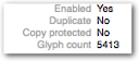
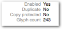
If you switch to the Info view (⌘I) you can see the total number of glyphs contained in the font:
Arial Unicode ┈┈┈┈ DejaVu Sans ┈┈┈ Lucida Bright
Another excellent tool for everything font and glyphs is PopChar. It has a similar functionality as the OS’ Character Viewer, but if you are interested in those things, check it out.
This is most likely because the font you try to switch to doesn’t contain the glyph. In that case TextEdit will auto-select a different font (or stay with the current one) instead of showing you an empty box.
2 Likes
thank you Tom.
I purchased PopChar, which has a search function contrary to Font Book (as far as I understand).
I think that if an arrow is inserted with a KBM, it is necessary to reset the font and font size of the space following the arrow.
thanks again
If you insert any text as plain text (i.e. without styling) it should adapt the current formatting settings at the insertion point (including font settings).
Yes, in Font Book you can only search for font attributes/metadata…

…, fortunately, I would say, since it is already sluggish enough as it is ![]()