Hello Peter,
I have a suggestion for the iOS app interface (particularly for the iPad version, which has a lot of unused screen real estate).
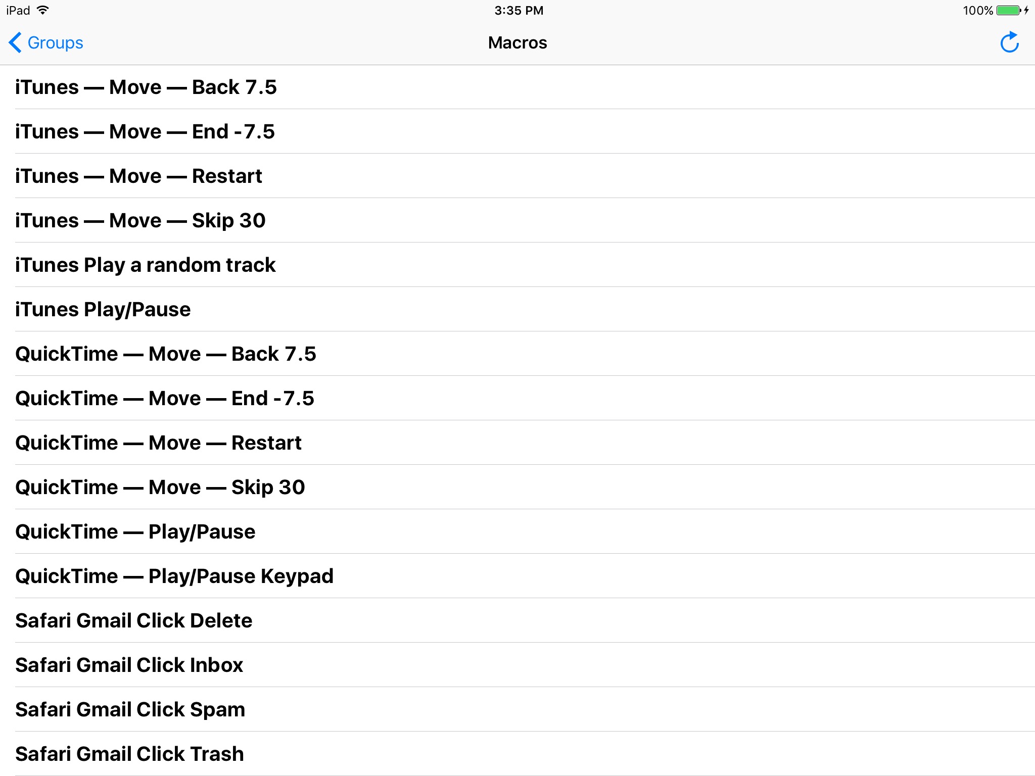
In the current KM app, on the iPad, there is a lot of white space. On this example screenshot, you can see that the right half of the interface is unused:
If you take a look at the interface of Launch Center Pro, they use a grid, which uses all of the screen. Additionally, buttons can be folders, which open instantly if you hold them (as seen on the Search button in the example):

Using this type of user interface could greatly increase the use of screen real estate, and allow the user to have macros organized in folders, yet quickly available.
Let me know if you have any questions, and I hope you'll consider this for a future update of the iOS version of Keyboard Maestro.
Jim