I am new to KM and want to replace ClipMenu with KM (among many others ideas). But the Clipboard History Switcher has a huge disadvantage: grey text on a black window is quite unusable. Text snippets are hard to read and to differentiate.
Any chance to change the look of the Clipboard History Switcher or at least to increase the font size and/or the contrast? E.g. black text on a white window (I do not mind too much about text style, insert as plain text is actually “enough” for me).
Well, it’s like this. I could not ship 7.0, and instead continue work knocking off some more of the thousand or so remaining features on the todo list, including redesigning the Clipboard History Switcher, or I could draw the line somewhere and ship Keyboard Maestro 7.0 and then continue work knocking off some more of the thousand or so remaining features on the todo list, including redesigning the Clipboard History Switcher.
I chose the latter.
Redesigning the Clipboard History Switchers, either to allow them to be themed (which is really hard because the text has its own unknown color and styles) or something more like the spotlight-like style of the Trigger Macro By Name or Insert Action windows. I’m leaning towards the latter.
And since Apple seem to introduced a bug in El Capitan that messes up the initial display of the Clipboard History Switcher, and probably wont get around to fixing it until 10.11.3 if ever, its quite likely this is going to become a high priority item in the next couple months.
Have you been able to make any progress on allowing color theme customization for the Clipboard History Switcher? Any chance of this being release any time soon?
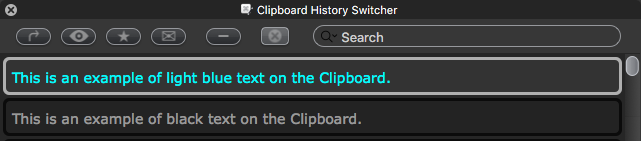
Here's what it looks like now in Keyboard Maestro 7.1.1 (7.1.1) on OSX 10.11.4:
The text on a clipboard is fairly readable, but the real challenge is the buttons, which are hard to see unless I have my MBA screen brightness on max.
If you could just make the buttons more readable, like a color icon on a grey background, that would be great!