Welcome aboard @Ward.
Keyboard Maestro and Quickeys are very different and you will no doubt find some of the differences jarring. If you have not already, I strongly encourage you to read the Transition From QuicKeys article which will help the transition.
Enabling and Disabling a macro you do not currently have selected is not a particularly common action - adding a checkbox to every single macro entry would be a lot of clutter for insufficient gain. If the macro is selected, then it is already a single action, either the menu or the tick in the macro column or the tick at the top right of the macro edit view.
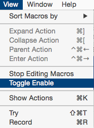
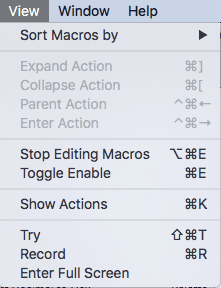
As for the display of disabled being too subtle, I guess that depends on your monitor settings perhaps, it seems pretty clear to me:
In the case of seeing which one is enabled and preferring a checkbox, I think that's just a case of what you are used to seeing rather than what is objectively clearer.
As for the View menu being misnamed, yes, it is. It is basically a catch all for various macro related activities. I would call it Macro, but that's not really accurate either as it applies to macro groups too, and if I did, then I'd have to have a View menu just for the Enter Full Screen and Sort options. And maybe the Show Actions, because that's kind of View like, or perhaps its kind of Macro like. And this is where things get confusing and unclear.
If anyone has a concrete suggestion for renaming the menu and reorganising the items in it, I'm happy to hear it, but I don't think it is as easy as it might appear at first glance. Someone might surprise me though, and that would be great.
If only there was a simple, correct, universal answer to every design decision, then this job would be a lot easier (and every application would look identical).
Keyboard Maestro doesn't use Command-E for the shortcuts because that is system wide for Use Selection for Find, but feel free to follow @Tom's method and give it a shortcut, Command-E or otherwise - it's your Mac, you get to choose.