Perhaps I’m not following you, but are you talking about Button Creator? If so, you can resize the icon and text to reduce the surrounding space.
Hey Chris
Yes, I speaking of Button Creator. I bought it knowing I might find it too limited for me and it is. I'm not begrudging the use of the app for any who might find it useful. Part of going ahead and buying it knowing I might not use it was to incentivize the author to continue to develop the app and have grounds to write to him and make feature requests. I'd love to have a dedicated mini drawing app to make icons, especially if it would export as .icns that could be dragged directly into Keyboard Maestro's icon image well, thereby saving me those conversion steps.
I have spent tons of enjoyable time making icons for macros and am confident I'm on the far edge of outliers in pushing the boundaries of palette use. In some of my other posts are pics of some of these extremes. Given this is Keyboard Maestro and not Palette Maestro, I've gone as far as I can with the tools available and am content with the tools. I'm always hopeful and happy when new capacities show up that move triggering macros in a more visual direction, as that is my minority preference.
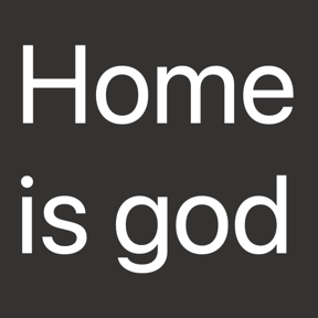
I'm including here a few sample icons I made with Button Creator. While it's not a built-in function to make a text-only icon, you can get around that by making the image color the same as the background color, which leaves it there but invisible. If you play around with the size of the text, you can even push it to two lines. As you can see, it pretty well fills the available space. Still, it's a single line of forced text and not two separate lines and thereby significantly limited.
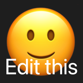
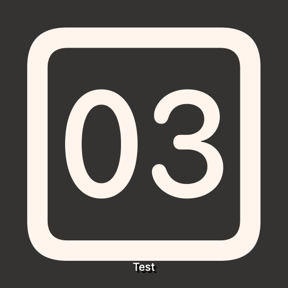
The major limitation shows up when you combine an image and text, which I frequently do. As you can see, the sizes of both are balanced with one getting smaller as the other gets bigger. When you balance the two, the 'padding' around them is large. Given the final icons are quite small, the loss of almost any space has a significant visual impact.

Not bad
Not bad
Maybe
Unusable

Unusable

Not really

Way too much padding

About as good as it gets within the app's limits
Ditto
Made with Affinity Designer
Made with Affinity Designer