As long as we go forward using this amazing application we make more and more macros and palettes to make our tasks easier. As a UX Designer, I'd like to help to fix some UI designs, so users can enjoy more using this application.
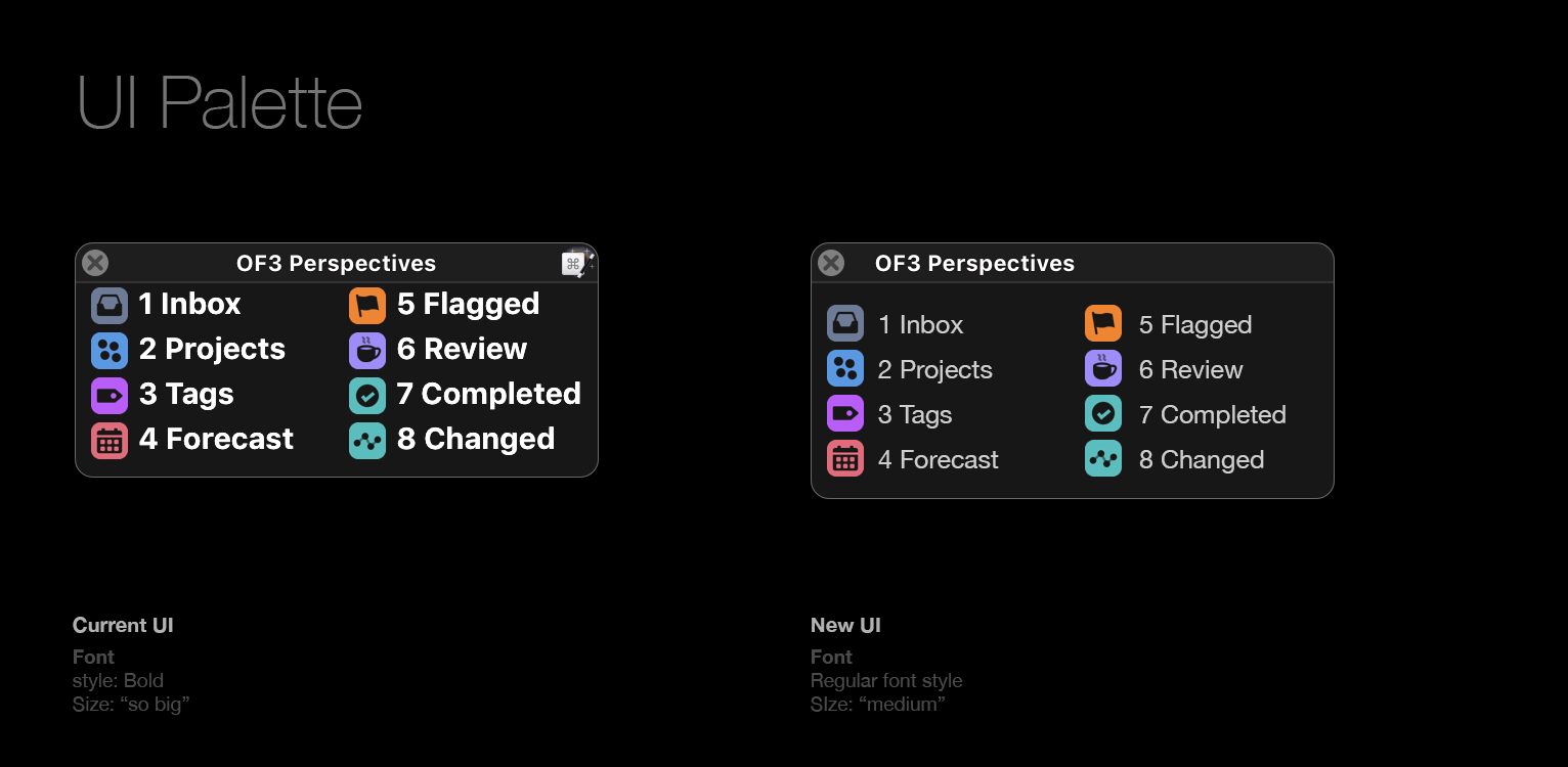
This is the first pallet that I worked on and I'd like to work on other pallets. I changed the font style and the size of the font. I removed the KM icon form the top and shifted palette name to the left. Also, I added more gaps to the top and bottom of the window to make it more legible.
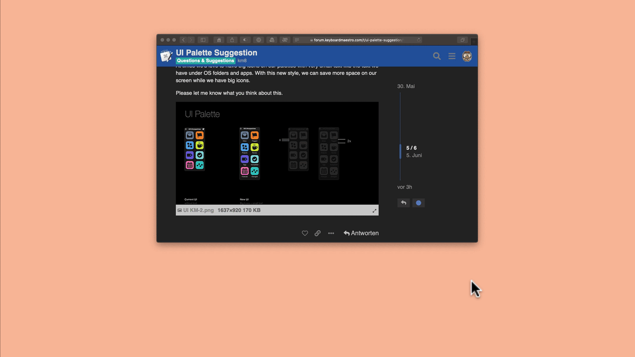
Thanks, Peter! I can't wait to see and use the changes in my palettes.
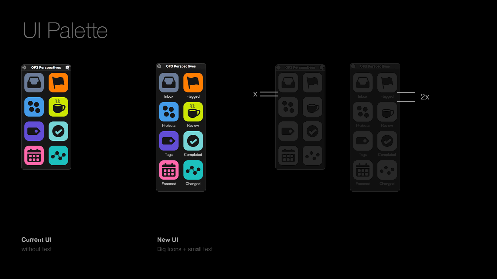
I'd like to show you another idea that you might like.
At times we'd love to have big icons on our palettes with very small text like the text we have under OS folders and apps. With this new style, we can save more space on our screen while we have big icons.
Fortunately Keyboard Maestro leaves us a lot of room @shirazigs. I like to design my palettes without text and create meaningful icons that refer to the app and the function contained in the macro (here screenshots with Yoink for Mac).
With a lot of help from @GrandmasterHH I am trying to create a CSS Circle.
The eye also works a little bit daily with
The view of the icons in the palettes I deliberately chose to be so small.
I have no knowledge of CSS or HTML. Thanks to the help of @GrandmasterHH I was able to create the circle shown in the gif.
The circle is a template I downloaded from this website. So that I can execute macros in KM, I use the floating HTML action of BetterTouchTool. A more detailed description can be found in this blog entry.
As already mentioned, I don't know how to deviate from the template and how to use my own icons (like in the gif) instead of the prefabricated items in the buttons. You'd have to rewrite or re-create some things for that.
Maybe you can find someone in the forum who can do that.
If you are interested, I can send you the folder to the template with pleasure.
This example uses icons from Font Awesome. You can easily change the icons by renaming them in the HTML. You can find the appropriate names on the font-awesoem website.
So if you pop over to Font Awesome and see something you like, you should just be able to change the reference in the HTML from:
<i class="fa fa-clock"></i>
to what you saw that you liked:
<i class="fa fa-allergies"></i>
because the header seems to include access to all of those icons:
You are for me (and also for @appleianer) simply the greatest godfather of HTML/CSS. A thousand thanks for your commitment, we appreciate that very much.
I want to thank @BernSh for the idea to call macros with a radial menu,
At @GrandmasterHH for several hours of intensive work on the CSS HTML file and a special thank you goes to @shirazigs & @mrpasini, without whose help, the floating HTML action from BetterTouchTool would not work.
For the world's best togetherness in a forum I forgive
This is my dream team of (conflict) palette usage in Keyboard Maestro:

 How long does that take to make one?