In dark mode, the checkmark icons in the right click menus in the KM editor are also dark, making them hard to read.
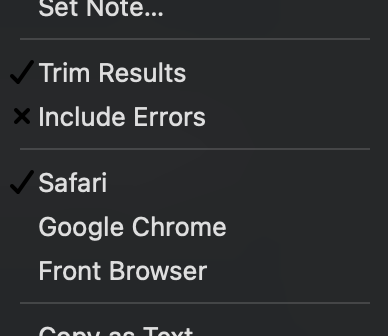
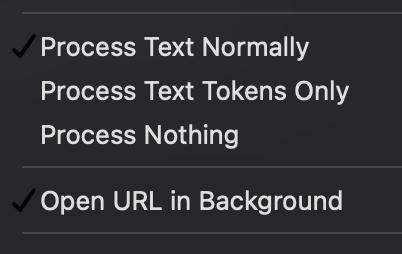
In dark mode, the checkmark icons in the right click menus in the KM editor are also dark, making them hard to read.
I think you’re seeing the Sonoma problem mentioned in this thread:
The last post in the thread mentions that Apple have acknowledged it as regression so it should be fixed in a future MacOS release.