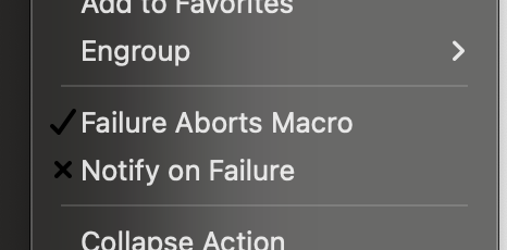
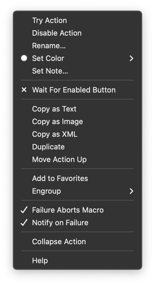
@peternlewis - just noticed a tiny bug in KM v11 - when KM is set to dark mode the check marks in the gear menu are not white as they were before. They now look like this:

@peternlewis - just noticed a tiny bug in KM v11 - when KM is set to dark mode the check marks in the gear menu are not white as they were before. They now look like this:

@Zabobon Yes! I use dark mode too. I had considered those options, but it looked like they were already unchecked.
Noted. Thanks.
I looked a this but I can't duplicate it in Ventura.

So I'll need some more information on this to try to figure it out.
It seems to be a Sonoma issue. I've got two Macs both running KM11. One is on Sonoma the other still on Ventura.
Looks like you've got transparency (or some such) set to "on" in the second image.
I think it just looks slightly different because the two images were taken from two different Macs and one was over a white background.
OK - I can see that now!
OK, yes, this seems a Sonoma menu issue. I have reported it to Apple. The menu system in Sonoma has been rewritten entirely so that's probably the cause. I'll see if they respond and if not see what I can do about working around it.
EDIT: Apple are aware of the regression. I would expect it to be fixed in a future update of Sonoma.