Interesting direction to look from inside out. From macro creation to UI creates a UI dependency. Looking from outside in, from task to tool allows more UI flexibility and options.
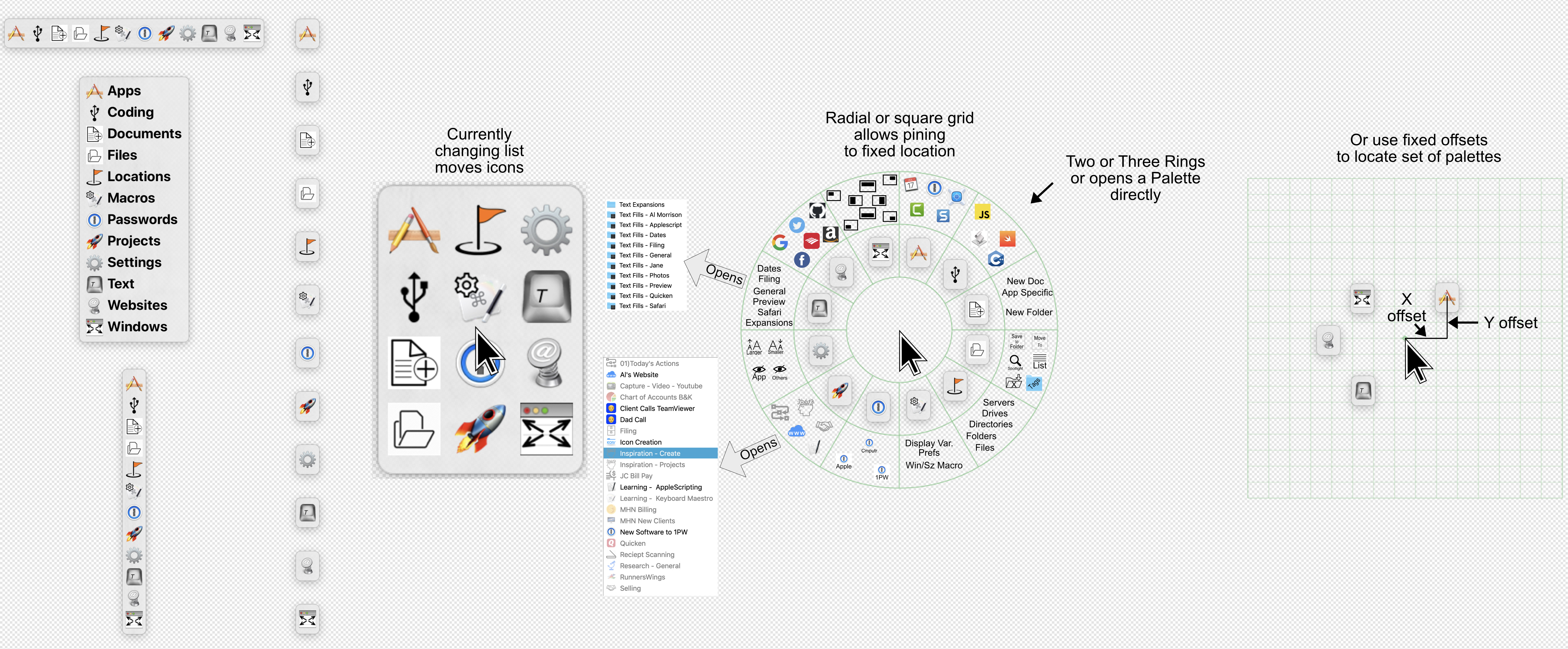
Given the present “locate palette under cursor” option, would it take much to add a locate palettes with a x,y offset from cursor option? This would allow a fixed relationship of palette to cursor alleviating the disorientating spacial reshuffling that adding or deleting macros to a grid currently creates.
If that seems too chaotic, another option could be a few fixed grid options to plug individual palettes into.
Also, instead of a second ring, there could simply be one ring design of however many slots that keeps getting called when any item on the current ring is selected.
Ring-menu is not available in the US app store. I downloaded QS and the QS radial menu plugin but can't get it to open. It's from '07 and may not be working. Have you had success with it?
I'd amend what you said to "With a certain coding understanding, creativity and HTML, you can customize it to your needs." Yes I agree. Thank you for putting the tools within reach. Excellent!!!
God, are the people here great! I am moved by the generosity demonstrated over and over again. Thank you again!
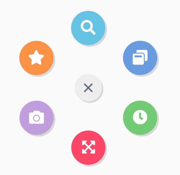
I once used the template idea of BTT @BernSh and created a small radial menu with the help of a template from the internet and a lot of help from users of the KM Forum.
Thanks to the combination of KM and BTT this was possible:
The last couple of years I've been teaching a lot of Accessibility/Section 508 Compliance in Web Design and Electronic Documents. WCAG contrast guidelines are a huge part of what I teach and remediate in org's documents. At one point, during one class, I showed off Keyboard Maestro (I show it off in a lot of classes, but this was specific) and realized that the color contrast for several themes is not accessible. For most themes it is though. Your high-contrast option just got me thinking about that.
Sounds good, I'll look at adding it for a future version.
It seems reasonable that some but not most of the themes have insufficient contrast. Based on Apple’s behaviour, it seems there is a lot of folks who prefer inaccessible low contrast, so it is reasonable to have themes for those folks even if they aren't as usable as other themes.
Hi, I'm trying to figure out the color settings for the palette and I realize that there is a textured background behind it. Why and can we remove it?...