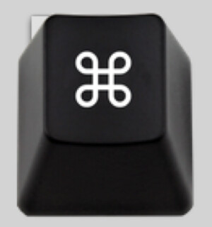
You're right about the glitch in the icon, and there is a further issue in one of the smaller resolutions as well.

I do like the style of your alternatives, the texture and the slight glow of the ⌘ symbols are very nice, though I prefer the taller look of the originals. The one with the wand is particularly nice as well, though I prefer the darker icon, but that might be just because I have a dark keyboard.