Custom Palette Style Colors?

I like this ability to apply a gradient to any color.
Also, if it is not too hard... can we have an option to have text "flush left" without icon (instead of just centered text)?

Can't wait for the new version!

2 Likes

For the next version I have added an enhanced custom palette system that allows gradients for the various backgrounds.

image

4 Likes

:grin::+1::+1::+1:
Thank you!

1 Like

Done for the next version.

3 Likes

Under the Giv'em a inch..." banner would/have you considered radial menus? I've found a simple four finger flick up or down gesture on a trackpad (allowed for with BetterTouchTool) to trigger a palette to appear under the cursor to be an excellent experience. For example:

A next level of refinement could be altering the "Palette" / Menu of options to assume a more aesthetic and efficient arrangement. Here are some designs and links for inspiration. 20111002-221153

Animated-Circle-Menu-with-jQuery-CSS3 javascript-css-circular-menu radial-context-menu-wpf_861507 portfolio-compass

http://www.jemome.com/p-radial-context-menu-861503/

I know you're not going to stop the presses and get right on this. This is just to get it into the pipeline.

Thank you.

2 Likes

Radial menus are on my radar (sorry, really pad pun). I have no current plans to implement them, but it has been something I have looked at occasionally. I have not really found a good way for them to fit within Keyboard Maestro - really they would seem to work best in a case where you have a hierarchical structure of actions you want to perform, each with level with around eight options, so that you can start the selection, then go in a direction to get to the next level, then fan out from there.

That does not seem like a natural fit for Keyboard Maestro - it is not that you could not construct such a hierarchy, but it wouldn't fall naturally out of normal macro creation.

3 Likes

You could use a 3rd party app to launch KM macros in a radial menu.

I believe that Quicksilver has a plugin for Radial Menu system. Should be able to integrate with KM quite nicely.

This one looks very interesting, but I am not sure if the developer is supporting it anymore.
http://ring-menu.com

I for one have fun with puns so I’ll run with it :wink:

Interesting direction to look from inside out. From macro creation to UI creates a UI dependency. Looking from outside in, from task to tool allows more UI flexibility and options.

Given the present “locate palette under cursor” option, would it take much to add a locate palettes with a x,y offset from cursor option? This would allow a fixed relationship of palette to cursor alleviating the disorientating spacial reshuffling that adding or deleting macros to a grid currently creates.

If that seems too chaotic, another option could be a few fixed grid options to plug individual palettes into.

Here's a thought:

Also, instead of a second ring, there could simply be one ring design of however many slots that keeps getting called when any item on the current ring is selected.

Ring-menu is not available in the US app store. I downloaded QS and the QS radial menu plugin but can't get it to open. It's from '07 and may not be working. Have you had success with it?

Thanks!

I have seen a radial menu with a Floating HTML Menu within BetterTouchTool.

With creativity and HTML, you can customize it to your needs.

31

1 Like

Usually I work with a vertical palette that contains sub macros @BernSh.
However, if it doesn't have to be round, a square suggestion would be :wink:

2019_06_01_Support_

@appleianer Damn fine suggestion, thank you!

I'd amend what you said to "With a certain coding understanding, creativity and HTML, you can customize it to your needs." Yes I agree. Thank you for putting the tools within reach. Excellent!!!

God, are the people here great! I am moved by the generosity demonstrated over and over again. Thank you again!

1 Like

I once used the template idea of BTT @BernSh and created a small radial menu with the help of a template from the internet and a lot of help from users of the KM Forum.

Thanks to the combination of KM and BTT this was possible:

2019_06_09_Support_

1 Like

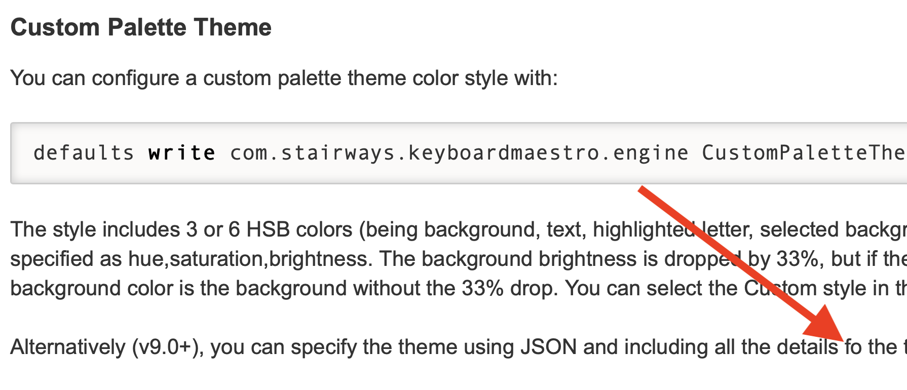
At this location the word "for" is misspelled:

Screen Shot 2019-11-19 at 5.35.26 AM

1 Like

There are some dark themes and some "first letter high contrast" themes, but none with both. So I created: "0,0,0, 36,3,40, 205,90,90"

Maybe I'd name it after my favorite obsidian theme Blue Topaz:

Screen Shot 2022-09-21 at 9.16.23 PM

2 Likes

I like it!

The last couple of years I've been teaching a lot of Accessibility/Section 508 Compliance in Web Design and Electronic Documents. WCAG contrast guidelines are a huge part of what I teach and remediate in org's documents. At one point, during one class, I showed off Keyboard Maestro (I show it off in a lot of classes, but this was specific) and realized that the color contrast for several themes is not accessible. For most themes it is though. Your high-contrast option just got me thinking about that.

1 Like

Sounds good, I'll look at adding it for a future version.

It seems reasonable that some but not most of the themes have insufficient contrast. Based on Apple’s behaviour, it seems there is a lot of folks who prefer inaccessible low contrast, so it is reasonable to have themes for those folks even if they aren't as usable as other themes.

2 Likes

Added for the next version.

Thanks.

2 Likes

Hi, I'm trying to figure out the color settings for the palette and I realize that there is a textured background behind it. Why and can we remove it?...