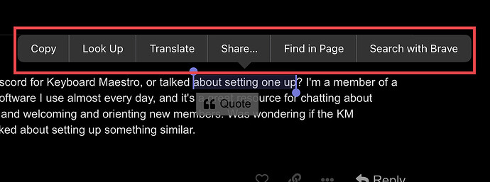
Is there any way to make pop up menus like flowing photo
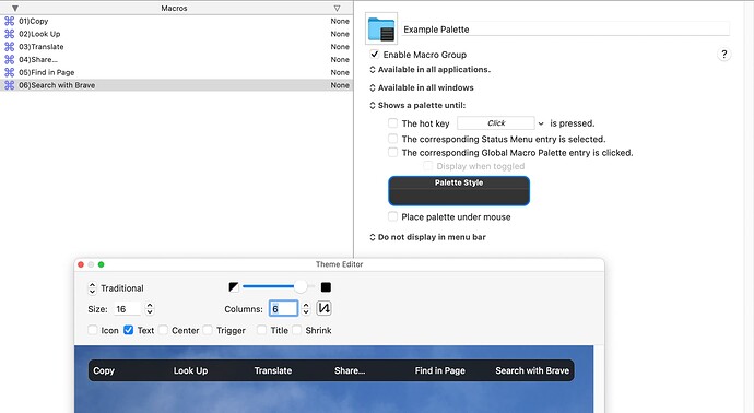
You can easily make palettes, eg:
Or you can use a Custom HTML Prompt action and do anything you want.
Thank u very much. It is more useful to use a Custom HTML Prompt for me. Is there any example for HTML. I am not good at HTML.
There are quite a few macros and other examples of how to use the prompt on this forum... for instance:
Custom HTML Prompt with total control of display - Tips & Tutorials - Keyboard Maestro Discourse
FWIW my HTML knowledge is extremely basic, and a few months ago was essentially zero. But after some Google-fu I learned enough to build several of my own custom prompts for a few macros. If you want to see one, see this sample code for my macro: KMF: Redesigned: Quickly Create a New Expansion With Typinator (using Typinator’s AppleScript dictionary)
Sample HTML (click to expand/collapse)
<!DOCTYPE html>
<html>
<head>
<style>
body {
background-color: rgba(50,50,50,0.95);
color: rgba(255,255,255,0.7);
font-family: arial
}
select {
font-size: 100%;
background: rgba(255,255,255,0.3);
background-image: url("data:image/svg+xml;utf8,<svg fill='black' height='24' viewBox='0 0 24 24' width='24' xmlns='http://www.w3.org/2000/svg'><path d='M7 10l5 5 5-5z'/><path d='M0 0h24v24H0z' fill='none'/></svg>");
background-repeat: no-repeat;
background-position-x: 100%;
background-position-y: -2.5px;
color: rgba(255,255,255,0.75);
border: 1px solid rgba(155,155,155,0.5);
border-radius: 5px;
padding-left: 10px;
padding-right: 15px;
width: 300px;
height: 25px;
-webkit-appearance: none;
}
select:is(:hover, :focus) {
font-size: 100%;
background: rgba(255,255,255,0.4);
background-image: url("data:image/svg+xml;utf8,<svg fill='white' height='24' viewBox='0 0 24 24' width='24' xmlns='http://www.w3.org/2000/svg'><path d='M7 10l5 5 5-5z'/><path d='M0 0h24v24H0z' fill='none'/></svg>");
background-repeat: no-repeat;
background-position-x: 100%;
background-position-y: -2.5px;
color: rgba(255,255,255,0.85);
border: 1px solid rgba(255,255,255,0.6);
border-radius: 5px;
padding-left: 10px;
padding-right: 15px;
width: 300px;
-webkit-appearance: none;
}
textarea {
font-size: 100%;
background: rgba(255,255,255,0.1);
color: rgba(255,255,255,0.75);
border: 1px solid rgba(155,155,155,0.5);
border-radius: 5px;
padding-left: 10px;
resize: yes;
width: 286px;
height: 20px;
}
textarea:is(:hover, :focus) {
font-size: 100%;
background: rgba(255,255,255,0.2);
color: rgba(255,255,255,0.85);
border: 1px solid rgba(255,255,255,0.6);
border-radius: 5px;
}
table {
width: 100%;
}
table, th, tr, td {
border: 0px solid;
padding-left: 5px;
padding-right: 5px;
}
td.extrapadding {
padding-bottom: 5px;
}
button {
font-size: 100%;
background: rgba(255,255,255,0.1);
color: rgba(255,255,255,0.75);
border-radius: 5px;
border: 1px solid transparent;
}
button:is(:hover, :focus) {
font-size: 100%;
background: rgba(255,255,255,0.2);
color: rgba(255,255,255,0.85);
border-radius: 5px;
border: 1px solid transparent;
}
button.submit {
font-size: 100%;
background: rgba(0,75,255,1);
color: rgba(255,255,255,0.75);
border-radius: 5px;
border: 1px solid transparent;
}
button.submit:is(:hover, :focus) {
font-size: 100%;
background: rgba(0,100,255,1);
color: rgba(255,255,255,0.85);
border-radius: 5px;
border: 1px solid transparent;
}
<!-- .checkbox { -->
<!-- background: rgba(255,255,255,0.0); -->
<!-- } -->
*:hover {
cursor: default;
}
*.submit:hover {
cursor: copy;
position: relative;
}
*.cancel:hover {
cursor: pointer;
}
*.menu:hover {
cursor: context-menu;
}
*.textfield:hover {
cursor: text;
}
*.checkbox:hover {
cursor: cell;
}
</style>
<script type="text/javascript">
function KMWindow() {
let select = document.getElementById("setName");
let data = document.kmvar.localsetname;
let items = data.split("|").filter(s => s != "");
items.forEach(item => {
let option = document.createElement("option");
option.text = item;
select.add(option);
});
winBounds = window.KeyboardMaestro.GetVariable("localWinBounds");
if(!winBounds) {
winBounds = window.KeyboardMaestro.GetVariable("localWinBounds");
}
return winBounds;
}
</script>
<title>Create a New Typinator Expansion</title>
</head>
<body>
<h2 style="text-align: center;">Follow the instructions to create your new Typinator rule</h2>
<h4 style="text-align: center;">Hover over each item to see additional information.</h4>
<form id="myform">
<table>
<tr title="Select the Typinator set you would like to add the new rule to.">
<td class="extrapadding" style="text-align: right;">Set Name</td>
<td class="extrapadding"><select name="localsetname" class="menu" id="setName" style="width: 300px"></select></td>
</tr>
<tr title="Type the abbreviation you would like to type to have expanded.

Click and drag the bottom-right corner to increase this field's size.">
<td style="text-align: right;">Abbreviation</td>
<td><textarea name="localabbreviation" id="abbreviation" class="textfield" placeholder="Type your abbreviation here" required></textarea></td>
</tr>
<tr title="Type the word or phrase you would like to have appear after typing the abbreviation.

Click and drag the bottom-right corner to increase this field's size.">
<td style="text-align: right;">Expansion</td>
<td><textarea name="localexpansion" class="textfield" placeholder="Type your expansion here" required></textarea></td>
</tr>
<tr title="You can add a description that will appear in the main Typinator window here.

Click and drag the bottom-right corner to increase this field's size.">
<td style="text-align: right;">Description</td>
<td><textarea name="localdescription" class="textfield" placeholder="Type an optional description here."></textarea></td>
</tr>
<tr title="Select how you would like to handle the abbreviation's case. More info can be found by hovering over each item in the dropdown menu.">
<td class="extrapadding" style="text-align: right;">Case Handling</td>
<td class="extrapadding">
<select name="localcaseHandling" class="menu" id="caseHandling" style="width: 300px">
<option value="Case affects expansion" title=""Case affects expansion" means the expansion will match the abbreviations case; in other words "btw" becomes "by the way", and "BTW" becomes "BY THE WAY".">Case affects expansion</option>
<option value="Case does not matter" title=""Case does not matter" means no matter how you type the abbreviation, it will be expanded the same way every time.">Case does not matter</option>
<option value="Case must match" title=""Case must match" means you must type the abbreviation in the exact same case as you saved it in for it to be expanded.">Case must match</option>
</select>
</td>
</tr>
<tr title="Select what format you want to save the new expansion as. More info can be found by hovering over each item in the dropdown menu.">
<td style="text-align: right;">Format</td>
<td>
<select name="localformat" class="menu" id="format" style="width: 300px">
<option value="Plain Text" title="Plain text will be expanded to match the target document's format">Plain Text</option>
<option value="Formatted Text" title="Formatted Text will be pasted with a specific format; font, size, color etc, regardless of the target document's format.">Formatted Text</option>
<option value="Picture" title="Picture format is how to paste in images. NOTE: This is not currently supported with this macro!">Picture</option>
<option value="HTML" title="HTML expansions are not just text expansions that happen to contain HTML code, but rather a distinct expansion format that can be described in HTML. HTML expansions are most useful for mail applications that support rich text messages, such as Apple Mail, Microsoft Outlook, Airmail, Thunderbird, as well as many web-based mail services like iCloud Mail and Gmail.">HTML</option>
</select>
</td>
</tr>
<tr><th colspan="2" height="10"></th></tr>
<tr title="These are additional options for your custom description.">
<th></th>
<th align="left">Description Options</th>
</tr>
<tr title="If you select this option, the date will be prepended to the beginning of the description. This can be useful since Typinator does not natively support sorting by date added.">
<td></td>
<td><label class="checkbox"><input name="localprependDate" type="checkbox"> Prepend Date</label></td>
</tr>
<tr title="If you select this option, the abbreviation will be prepended to the description. This can be helpful to show the abbreviation when you have a custom description.">
<td></td>
<td><label class="checkbox"><input name="localprependAbbreviation" type="checkbox" class="checkbox"> Prepend Abbreviation</label></td>
</tr>
<tr title="If you select this option, the expansion will be prepended to the description. This can be helpful to show the expansion when you have a custom description.">
<td></td>
<td><label class="checkbox"><input name="localprependExpansion" type="checkbox" class="checkbox"> Prepend Expansion</label></td>
</tr>
<tr><th colspan="2" height="10"></th></tr>
<tr title="These are optional Typinator options that are not vital to the macro's execution but can be useful for creating more refined abbreviations.">
<th></th>
<th align="left">More Typinator Options</th>
</tr>
<tr title="Select this option if you want Typinator to require typing a non-alpha character after the abbreviation before it is expanded.">
<td></td>
<td><label class="checkbox"><input name="localwholeWord" type="checkbox" class="checkbox"> Whole Word</label></td>
</tr>
<tr title="Select this option if your abbreviation is a RegEx (Regular Expression) and it will be checked for proper formatting before being added to your Typinator set.">
<td></td>
<td><label class="checkbox"><input name="localRegExSet" type="checkbox" class="checkbox"> RegEx Set</label></td>
</tr>
<tr><th colspan="2" height="10"></th></tr>
<tr title="These are additional options that are not vital to the macro's execution but can be useful for verification, workflow etc.">
<th></th>
<th align="left">More Options</th>
</tr>
<tr title="Select this option if you would like to see a review of the new rule's details after adding it to Typinator.">
<td></td>
<td><label class="checkbox"><input name="localshowResults" type="checkbox" class="checkbox"> Show Results</label></td>
</tr>
<tr title="Select this option if you would like the new expansion pasted into your front window upon completion.">
<td></td>
<td><label class="checkbox"><input name="localpasteFrontDoc" type="checkbox" class="checkbox"> Paste In Document</label></td>
</tr>
<tr title="Select this option if you would like to open Typinator upon completion.">
<td></td>
<td><label class="checkbox"><input name="localopenTyp" type="checkbox" class="checkbox"> Open In Typinator</label></td>
</tr>
<tr><th colspan="2" height="10"></th></tr>
<tr><th colspan="2" align="center">
<button name="Cancel" type="button" class="cancel" style="width:100px" title="Click to cancel macro."
onclick="window.KeyboardMaestro.Cancel('Cancel')">Cancel
</button>
<button name="Submit" type="submit" class="submit" style="width:100px" title="Click to submit new rule to Typinator."
onclick="if ( document.getElementById('myform').checkValidity() ) { window.KeyboardMaestro.Submit('Submit') } else { document.getElementById('myform').reportValidity() }">Submit
</button>
</th></tr>
</table>
</form>
</body>
</html>
<!-- Original Submit button -->
<!-- onclick="window.KeyboardMaestro.Submit('Submit')">Submit -->
I was able to learn enough HTML and CSS (cascading style sheets) in just a couple of weeks to build that, so even if your experience is currently zero, I encourage you to take a stab at building something yourself because the long-term benefits are worth it.
Thanks. I will try to learn it. I hope to build macros myself.
You're very welcome. Let us know if you need further help!
can you help me about this question?
Can I ask a question?
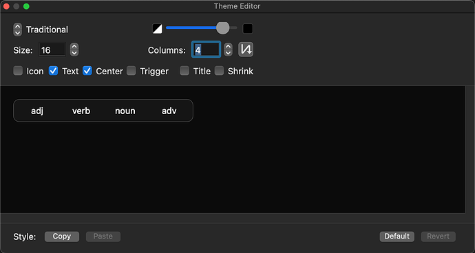
How to adjust the text alignment in the palette.
The options available are in the Palette theme. You can left/right/center the text for each button, adjust its size, etc. But all buttons need to be the same size.
Is what? You can left/center the text for each button (sorry, there is no right alignment), and adjust the size. But all buttons are the same size.
What is it you cannot find?
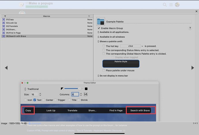
I see right text in your palette. How can do that.
You cannot right-align the text. All buttons are the size required for the largest button.
What you are seeing there is left-aligned text. The button on the right only appears to be right-aligned because it has the most letters and is filling the whole button space.
By ensuring that the last button is the longest string.
Ok, I got it. Thank you.


